
By Max Milano (Tech Writer)
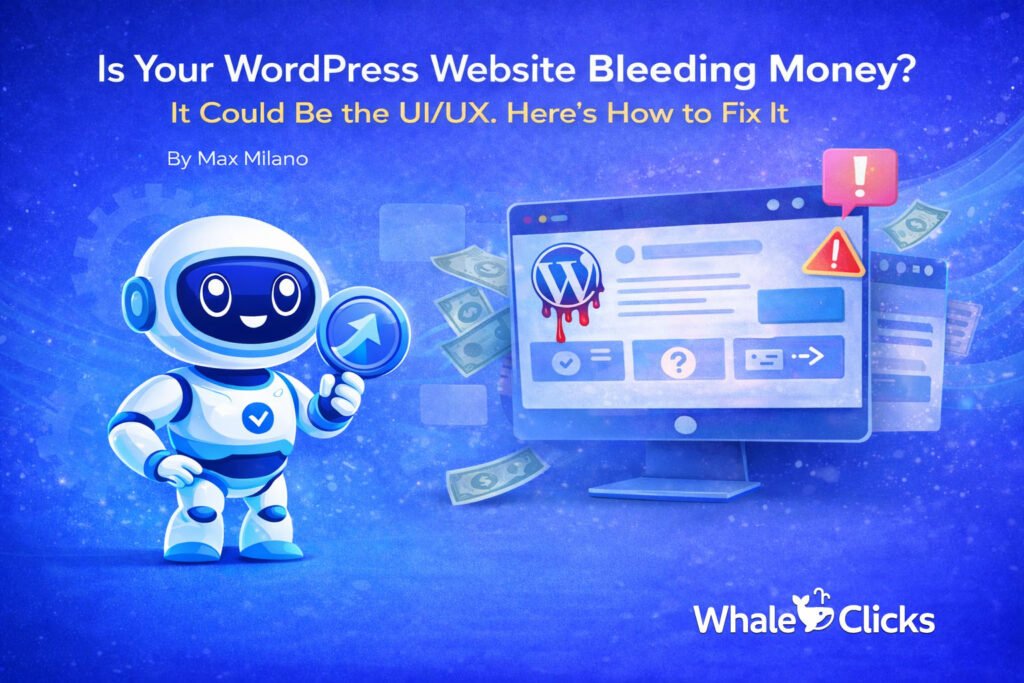
I once worked with a founder who proudly showed me their brand-new WordPress site as if it were a trophy. After months of revisions, endless Slack threads, and a designer who obsessed over animations, thay had a homepage that looked like it belonged in an awards gallery.
But the issue was that the site looked beautiful, but it was also burning money.
Paid traffic was landing but bouncing. Organic visitors were scrolling and disappearing. Contact form conversions were so rare they felt like statistical noise. When we finally watched real session recordings, the truth was plain to see. Users weren’t confused because the site was broken per se. They were confused because the site was doing exactly what it had been designed to do. It had been designed to look good, not to convert.
That’s the moment most businesses miss. A WordPress site doesn’t fail loudly. It fails politely. It lets traffic in, then quietly escorts visitors right back out without a sale, a lead, or even a conversation.
That’s where UI and UX make the difference between a website that behaves like a glossy brochure and one that works like a salesperson operating 24/7.
Good UI/UX has one main job: to drive conversion. That’s why every design decision should support a clear conversion pathway. Whether the outcome is a call, a booking, or a purchase, your WordPress site needs to be designed to generate revenue, not just vibes or pretty pages.
Let’s explore the ideal UI/UX process to turn a WordPress site into a conversion machine.
How to Use UI/UX Design to Help Your WordPress Website Convert
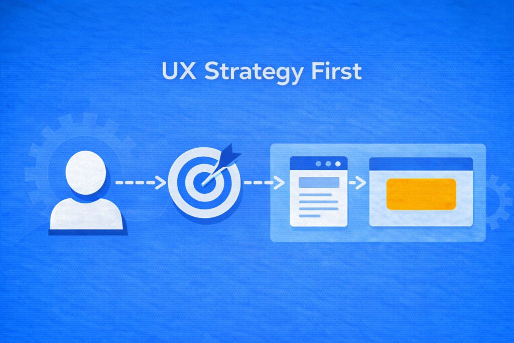
Step One: UX Strategy Comes Before Design
Most WordPress designs (or redesigns) fail before the first pixel is placed. They fail because they focus on aesthetics instead of user intent.
Conversion-focused UX design starts with a single question: What is the one action you want a visitor to take on your website?
That’s why the first UI/UX design deliverable should never be a mockup or a wireframe. It should be a strategy session. What are the business goals? What is the ideal audience? Is it B2C or B2B? Are you designing for the C-suite or the sales department? What common objections do customers have?
Answering these questions before embarking on UI/UX design helps create conversion pathways tailored to your ideal customers, which directly translates into more conversions and sales.
The next step is to get brutally specific. Decide what the primary conversion is. Then decide which secondary conversion supports it. Understand how and why someone arrives on that page (source). Is it PPC traffic from an ad? Will it be organic traffic? Both? Identify what makes customers hesitate before clicking your call-to-action button. Is it price? Trust? Timing? Confusion?
Once the customer journey is clearly documented on paper, designing your landing pages to address customer objections becomes easier, helping build a more logical and tailored customer journey.
Here’s the hard truth most teams avoid. If the customer conversion pathway isn’t obvious in your strategy document, it will not magically appear in your design.
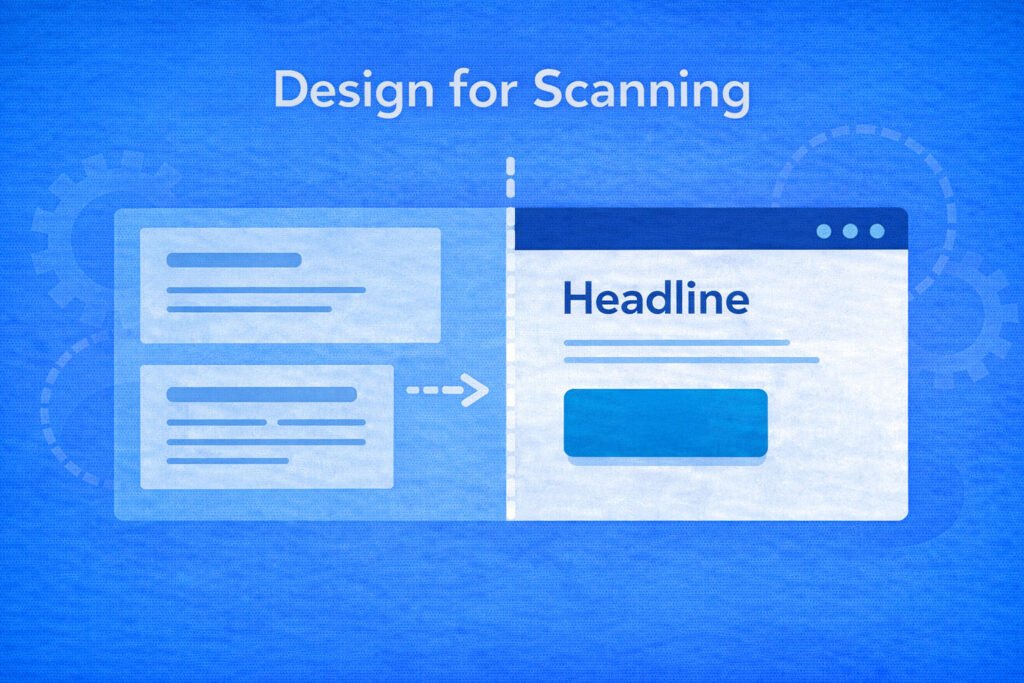
Step Two: Design for Scanning or Lose the First Five Seconds
People don’t read websites. They scan them like they’re checking highway signs at full speed.
If your design fights that behavior, conversions will drop even if your copy is strong. And if your layout requires effort, visitors will choose the easier option: leaving.
Good UI and UX are built around interfaces that feel calm, obvious, and trustworthy. That means consistent spacing, predictable typography, reusable components, easily clickable buttons, and forms that ask fewer questions and don’t feel like a trap.
The goal is not minimalism for style points. The goal is to reduce your customers’ cognitive effort.
Your visual hierarchy should make the next step obvious. Headlines should clearly say what you do. Subheads should explain who it’s for and why it matters. Buttons should stand out as actions, not decorative elements.
Inconsistent spacing quietly kills trust. When margins shift randomly, and alignment feels off, the site looks templated and rushed, even if it isn’t. Consistency signals professionalism and professionalism signals safety, and safety converts.
Each page should have one clear primary action. If your hero section presents competing calls to action, you’re asking users to decide before they understand your offer. Choose one strong call to action and support it after clarity is established.
The benchmark is simple. A stranger should be able to answer three questions within five seconds of landing on your site. What is this? Who is it for? What do I do next?
If they can’t, redesign the landing page. No amount of paid or organic traffic can fix a bad landing page with an unclear offer and CTA.
Step Three: Treat Every Page Like a Funnel, Not Content
Conversion-focused UX is funnel thinking applied to web design. A landing page is not just content. It’s a sequence in the customer journey.
A promise leads to clarity. Clarity leads to proof. Proof leads to action.
That’s why you must map the exact conversion pathway visitors should follow, rather than treating pages as free-form storytelling.
A high-performing WordPress landing page follows a predictable psychological arc. It opens with a clear solution to a real problem, not a clever slogan. It acknowledges an existing problem in the visitor’s language. It explains how your solution will help your customer. Then proves that the solution works (social proof), thereby removing friction. Then, and only then, it asks for the call to action with confidence.
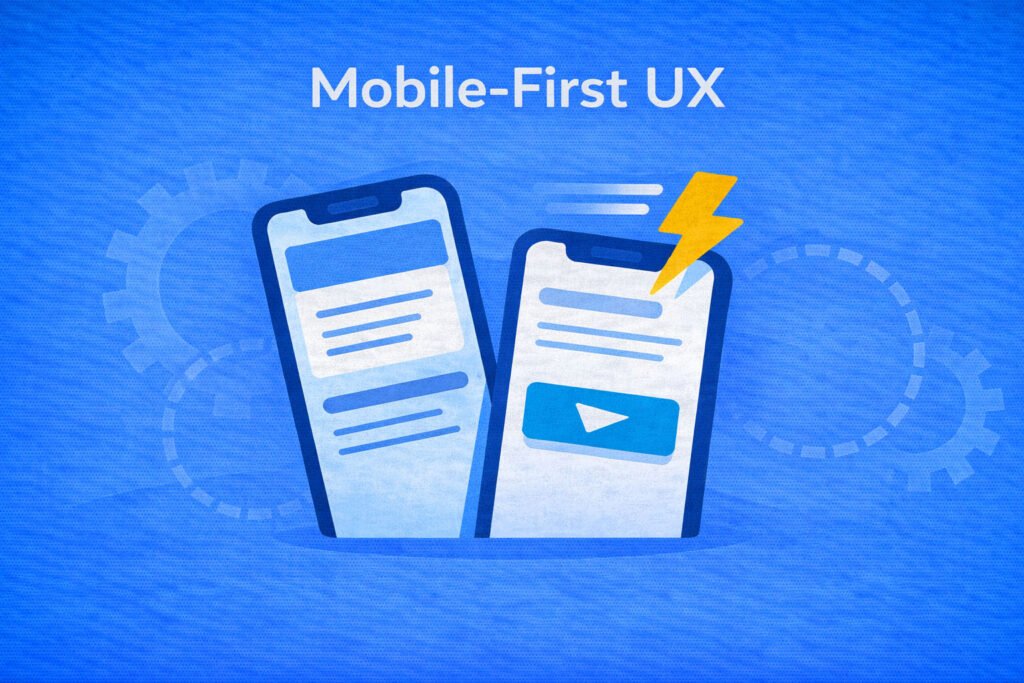
Step Four: Design for Mobile Performance
Mobile-first UX is not about shrinking desktop layouts. It’s about designing for real behavior. One hand. Small screen. Low patience. A distracted environment.
Readable typography matters more on mobile than anywhere else. Buttons need to be easy to tap without precision. Forms should feel merciful. Mobile pages should load quickly without visual jumps or layout shifts.
Most websites receive eighty percent or more of their traffic from mobile. Your design must reflect that reality without neglecting desktop and tablet UX.
Step Five: Launching Is Just the Beginning, Not the Finish Line
Most web design teams treat launch day like a victory lap. In reality, launch day is when assumptions meet real user behavior.
Once people start interacting with your site, patterns emerge. Where do users stop scrolling? Which calls to action are ignored? Where are forms abandoned? Which sections never get seen?
You don’t need to be a data expert to improve conversions. At a minimum, you should know which CTAs get clicked, how many users start forms versus complete them, how far visitors scroll, and how different traffic sources behave on the same landing page.
Then you iterate and A/B test calmly and intentionally.
Small improvements based on real behavior compound faster than dramatic redesigns.
A conversion-focused WordPress site is never finished. It evolves with your offers and with user behavior. Your job is to guide that behavior by continuously A/B testing and improving the UI/UX toward a single goal: more conversions.
UI/UX Design That Works Hard
UI and UX design should never be decorative; it should be used as conversion engineering.
At WhaleClicks, we design WordPress sites around strategy-first UX blueprints mapped to real conversions. We build clean, consistent user interfaces that are easy to scan and build trust. We deliver WordPress backends that clients actually own and can update themselves. We focus on mobile-first performance and SEO foundations that support growth rather than hinder it.
Our launch process includes QA, training, and integrations so your website becomes an integral part of your sales funnel, not a side project.
If you’re tired of paying for clicks that don’t turn into customers, the solution may be improving your web design. Contact WhaleClicks and let us help you turn your WordPress site into a 24/7 conversion platform.